Turbulence:
An Interactive Visualization of Flights
to / from Chicago O'Hare International Airport
|
Victor Mateevitsi |
Khairi Reda |
Download
Introduction
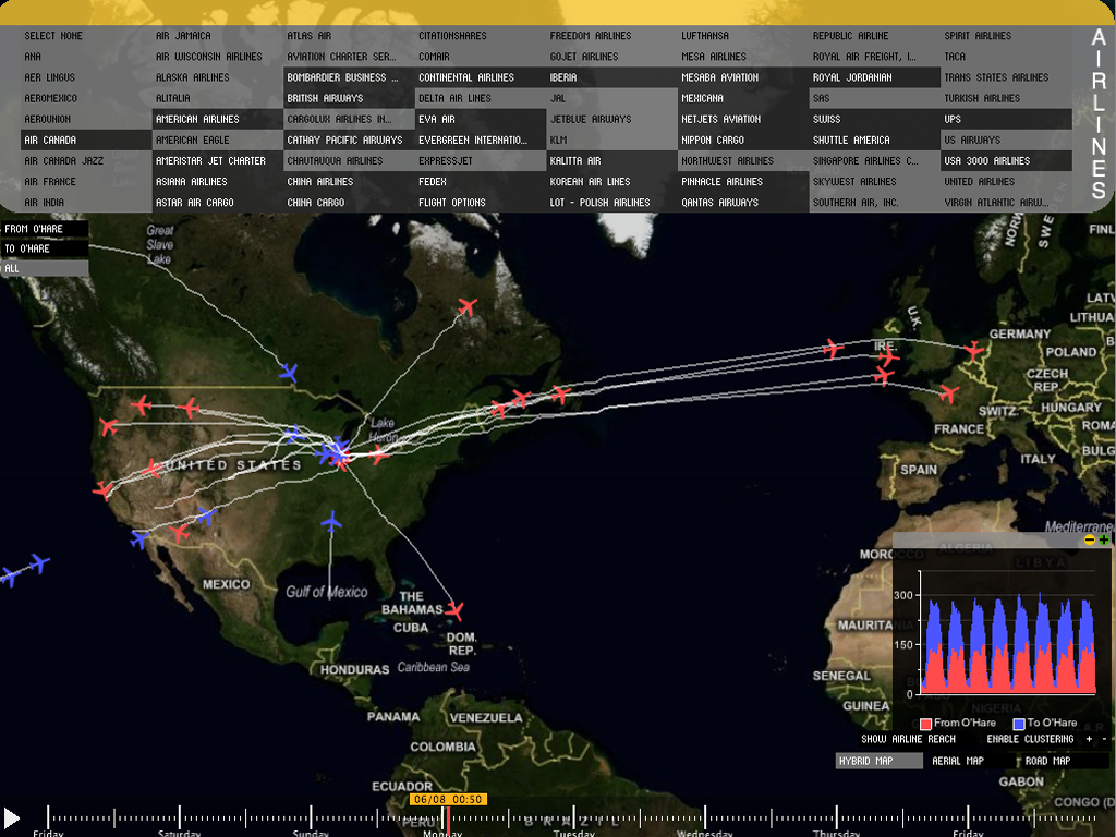
Turbulence is an interactive visualization of a week of flights originating from or terminating at Chicago O'Hare International airport from all over the world. The data visualized here comprises roughly 18,000 flights operated by 71 airlines over a period of 8 days (June 6 to June 12, 2009). The data contains a listing of each flight along with a series of latitude and longitude points specifying the path that the flight took. The location of flights is sampled approximately every 5 minutes.
The goal of this interactive visualization is to reveal flight patterns along with the desity of the airspace caused by traffic associated with O'Hare international airport. This information could be used to gain insights about travel patterns, or the different logistics employed by competing airlines. They could also be used to give an approximate measure on the environmental impact of O'Hare (noise, pollution, etc...), and what areas are hit with the biggest impact.
The visualization
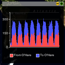
The visualization has two main components. First a geographical map plots the location of airplanes in the sky, along with the path taken by those planes during their flights. The map could also be used to show the density of airspace (ie, the number of airplanes in a particular region). The second components is a graph showing the total number of flights in the air, broken down by inbound and outbound flights (to and from O'Hare)
Visualization modes
The visualization offers three modes that display the same data in a different way:
This visualization shows the location of airplanes in the air, along with the path they took during
their flight. This is the default mode of the visualization

This filter causes the location of destination or origin airports for flights to be
drawn instead of rendering the path of flights. This mode is enabled by clicking on the appropriate button near the bottom right of the visualization

This mode clusters the airplanes based on their current location if the flight path mode was active, or clusters the destination / origin airports if the Airline reach mode was active. Clustering is enabled by using the appropriate button on the bottom right of the visualization. You can decrease or increase the grid size of the clustering, by using the (-) and (+) buttons accordingly. You can also use clustering while playing back the whole week.

The Map
The map data is downloaded from the web using the Virtual Earth API which provides very detailed aerial and road maps. The ModestMap Processing library was used to access this API. We provide three different kind of maps: a road, an aerial map, and a hybrid map which overlays streets and political borders on top of the aerial map. The user can switch between them using the buttons on the bottom right of the screen. The map can also be zoomed in/out or translated using traditional mouse control (mouse wheel + dragging with left button).
User interface
The geographical map is arguably the most important component of the visualization. Therefore, screen space has to be used wisely to allows more portions of the map to be displayed. The user interface components were implemented to minimize their foot print over the map. The user interface consists of: a timeline widget, a graph embedded in a window, and filters to limit the amount of data in the visualization.
Timeline
The timeline allows the analyst to select any point in time (from the observation period), and visualize the location of airplanes that were in flight at that moment. In addition to visualizing the location of the airplane, the path of the flight is also visualized. The timeline widget was placed on the bottom of the screen, so it can accommodate the drawing of a whole week. The control is transparent, in order to make the map more visible. If the mouse is placed over the control, meaning that the user wants to interact with it, the control will fade in. When the mouse leaves the control area, the control will fade out and blend into the map.
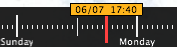
Manipulating the timeline is intuitive; a single slider can be dragged and positioned on the desired timestep. A small overlay shows the selected timestep (date - time).
The graph window
The graph shows the total number of flights in air, broken down into inbound (to O'Hare) and outbound (from O'Hare). Initially we discussed placing the graph on a left or right column of the visualization. This option sounded logical, but because of the data length, two problems arose:
Graph in the 'restored' state, which allows the graph to be moved when

Graph in the 'maximized' state. Notice how the time axis of the graph is aligned with the timeline widget
The airline filter
The problem with the airline filter was the number of the airlines. We had 71 airlines that originated from or terminated at Chicago O'Hare. Initially our thoughts were to implement the filter using a scrollable list, so the user can select which airlines he/she is interested in. On both of the cases, the problems were the same as with the graph window: we didn't wanted to decrease the viewing area of the map but we still wanted to implement an easy way to do that. The solution came upon us, when we spotted a ticket on our desk: The concept is that we have a window that seems like a ticket and the user can activate and deactivate the filters he wants to use. There is an option of hiding the window, not loosing viewing area from the map and of course the whole process is smoothly animated.
Icons and logos
The location of airplanes was visualized using a small airplane icon. The airplane icon is color coded to reflect whether it's departing O'Hare (red), or arriving at O'Hare (blue). This color code is consistent with the graph. The airplane icon used for displaying the airplanes in the air and for dragging the filter, was downloaded from aiga.org and are free of charge. Aiga has released a full set of airport icons and you can get it here.
The airline logos we used in the visualization were harvested using a wget script from airlinelogos.net and are licensed for non-commercial use. The rest of this paragraph is for Lawyers: Partial and other distribution means require the permission of Wings900.com. All logos displayed are the trademarks of the respective copyright holders. All rights reserved.
Interactivity
The visualization provides a number of interactive features to help the analyst limit the amount of information, and to switch between a number of different visualization modes.
Filters
There are three types of filters that can be used to limit the amount of data that goes into the visualization. Data that passes the three filters concurrently will be visualizes, everything else will not be shown. The filters also affect the clustering function.
Animation
This features allows the analyst to playback the flights and watch the movement of airplanes. The animation can be started / paused by pressing the traditional play/pause button located near the bottom left corner of the visualization. The animation can also be played in clustering mode, or when the Airline reach filter is selected, causing it to draw the destination and origin airports for flights in the air. This features is very useful for answering question such as: "where do flight from O'Hare head to at noon?".
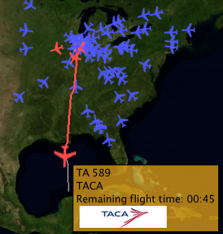
Hovering
Hovering with the mouse over an airplane shows an overlay display information about the flight including flight number, airline, remaining flight time, and a logo of the airline (if available). This also prevents the path of other flights from being drawn (so the analyst can focus on one interesting flight).
Questions about the dataset
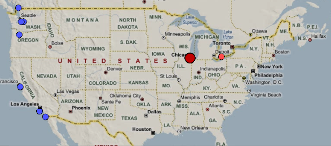
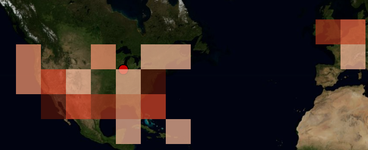
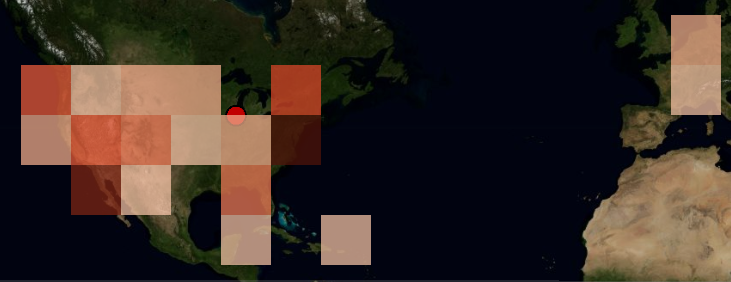
Pattern of domestic flights
Starting around 2am Central Time, Almost the entire O'Hare associated air traffic are flights originating from
the west coast (blue dots) where it would be 12am Pacific time. Presumably there are people who want to get early to Chicago/East Coast from the west coast.
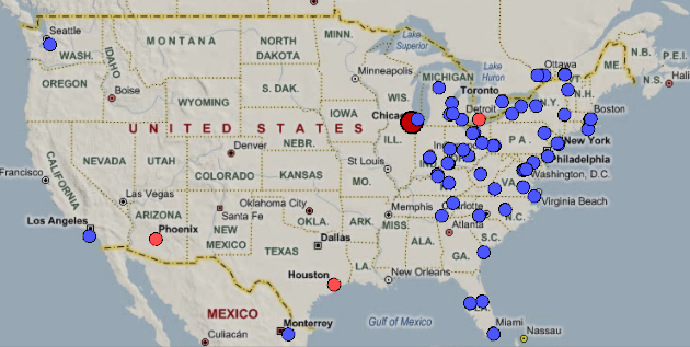
Around 6am Central time, we'll see almost all O'Hare flights are originating from the East coast (blue dots), where the time would be 7am Eastern time.
Again, these are people from the east coast who want to get early to Chicago or other places in the midwest/west coast.
The points of departures seem to conform well with the areas in the eastern time zone.
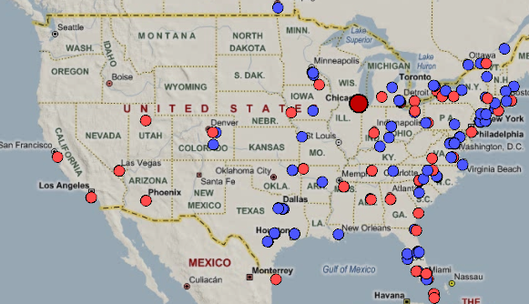
Around 8am, the traffic picks up with both inbound and outbound flights roughly dispersed over heavily populated areas
Traffic from the west is still scarce (with the exception of few flights heading from O'Hare to San Francisco and LA)
The rest of the country picks up after 9am.
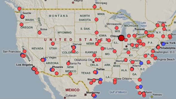
Around 9pm, most of O'Hare traffic switches almost completely to outbound traffic (red dots). We can also confirm this from
the graph by seeing a peak in the outbound traffic.
Comparing connections of Major Airlines
 American Airlines |
 United Airlines |
 Delta airlines |
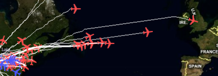
When do the airlines leave from Europe to Chicago?
It seems that there is a trend for leaving from Europe to Chicago. Airlines leave Europe during the local morning hours (between 09.00AM and 12.00AM) and reach Chicago during Chicago's local morning hours.
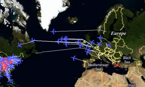
There is a trend for airlines flying from Europe to Chicago
When do the airlines leave from Chicago to Europe?
The same pattern seems to apply here, having airlines leave approximately at the same time (around 15.00 local Chicago time) and landing in Europe in the first morning hours.
There is a trend for airlines flying from Chicago to Europe
Is it possible to locate the lading airway the flights use?
While brushing time, you will notice that the airplanes take the same bearing when slightly before landing. It seems there are 4 different landing airways: northeast, southeast, northwest and southwest of the airport. The two most used are the northeast and southeast airways.
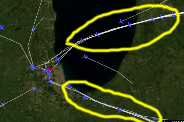
Landing patterns of flights.
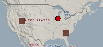
Can we see what happens when we have the less number of flights?
Initially we maximize the graph and brush to a time period when we have a low of number of flights. Let's go on Sunday morning around 05:00AM. We can see that the airport has almost no traffic.

No traffic during off-peak hours
Labour division
| Victor | Khairi |
| Graph | Map |
| Filters | Data structure |
| Clustering | Airplane paths |
| Interface | |
Last update: sep 28, 09